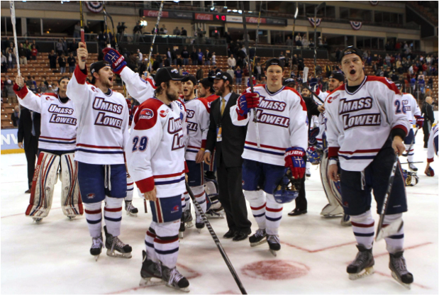
Photo courtesy of The Boston Herald
As we all know, the most important part of hockey is the jersey. Anyone could argue the importance of goals, defense and even basic rules for the game, but the true secret to a successful hockey team is their look. From Lowell Tech to UMass Lowell, our hockey team has always had a distinctive and fashionable jersey. After procuring a little background information on the River Hawks’ past jerseys with the help of Bob Ellis, the hockey play-by-play announcer, a list can be compiled of the best ones so far.
5. University of Lowell
This is truly a classic. The red with the blue accent makes for a bold and daring jersey. Bridging the gap between the University of Lowell aesthetic and the current UMass Lowell look, this incarnation utilizes subtle striping on its sleeves and torso, adding to the red rather than distracting from it. An interesting thing to note about this jersey is that it is the last one before blue was brought in as a main color.
4. Have I Seen This Before?
By this point moving into using blue as a primary color and red as more of a “spirit color” or an accent, the UMass Lowell hockey jersey during the mid-1990s looks awfully familiar. It signified a change from the University’s time as the Chiefs to the River Hawks. More importantly, Ellis said, “It seemed that during that time all of the other schools in the Northeast [were] wearing blue, so other schools went to the red… and then you get the accumulation of everyone wearing red and someone says ‘wait a minute’ and we back to emphasizing the blue.” Notwithstanding the rather clear resemblance to a certain Original Six NHL team, this jersey is still notable in that it is the first time where red is utilized as an accent instead of the main color for UMass Lowell. This jersey is fondly remembered by students past, and for good reason.
3. New Thirds
This jersey, unveiled at a special event during the last season, is very significant in UMass Lowell hockey history. It is the first jersey to use a logo—the River Hawk—on the front, without text since the University of Lowell Chiefs utilized only a logo on their jerseys. In order to be sensitive to the Native American populations residing in and around Lowell, the school decided to establish a new identity and become the River Hawks. “It was my own observation at the time, especially with the explosion of minor league sports, logos and things on merchandise began selling very well… I don’t know if that directly influenced… the school’s choice in using the logo more.. but we ended up becoming the River Hawks,” said Ellis. And yet, the River Hawk had only been relegated to patches on the shoulders and arms. This third jersey gives the River Hawk the recognition that it surely deserves, with a grey jersey color.
2. Representing UMass
When Marty Meehan became the chancellor of UMass Lowell, Ellis said that he insisted that “the front of the jerseys said ‘UMass Lowell,’ not just ‘Lowell…’ part of the institution trying to establish itself on more of a national and international stage in choosing its branding.” He picked the right time to do so. UMass Lowell won two back-to-back Hockey East championships with these jerseys. And how lovely they are; the shoulder region colored a bold red with the River Hawk emblazoned on it complements as well as accentuates the white of the jersey. It is simple, yet no less iconic.
1. Current Away Jersey
There is a lot of blue in Hockey East. It ranges from the deep navy of Notre Dame to the baby blue of the University of Maine. None of these blues, however, are as brilliant as UMass Lowell’s crisp, sharp, and royal blue. Here it is utilized in stunning fashion as the centerpiece of this beautiful jersey. The words “UMass Lowell” pop. The white and red shoulder decorations are minimal yet provide sufficient impact on any onlooker. Anyone passing by this jersey in the streets will be struck by the way the blue stands out in the crowd, and how the red and white are a subtle yet effective addition.
Honorable Mention: All of them. Literally all of them. We have always had fantastic jerseys.