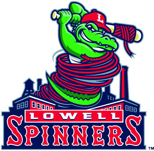
The Lowell Spinners were the ninth minor league team to change their logo in 2017. (Courtesy of Baseball America)
Ryan Delaney
Connector Staff
On Jan. 31, the Lowell Spinners unveiled a new logo that they will sport starting in the 2017 season. Rather than just the classic bat wrapped in twine, the Spinners used the former design to create the new one.
The new logo features an alligator wrapped in the twine but now holding the bat wrapped in twine as well. The gator is also sporting a ball cap with the letter L on the front to represent the city of Lowell.
Below the gator, there is a brief drawing of the city’s outline right above a sign that reads Lowell Spinners, with the Spinners being written in the traditional Spinners font that is donned across the game jerseys.
The unveiling of the new logo came as a bit of a surprise as most fans and students only found out about it when the team put the banners up on the walls outside LeLacheur Park.
The club has said that they felt it was time for a change in the logo and that they also wanted one the drew more attention to the name of the city. The Spinners are not a huge name team considering they are only a High-A short season club, but they take pride in being the only big four professional sports team to represent the city now that the Devils are out of town.
It is also something that they are an affiliate of the Major League club that plays in the same state and has such a rich history in the sport. It was only right for them to create a logo that represents the city that has supported them for the past 30 years they have been a franchise.
Short season A may not seem like a very important league, but when looking at the bigger picture, it actually is. Most the Boston Red Sox top prospects will play in Lowell at some point early on in their career.
Andrew Benintendi, the top prospect for the Red Sox and MLB Pipeline’s number one rated prospect in the sport, played in Lowell as recently as last season. His presence was a huge part in the attention that the Spinners drew over the past couple years.
The logo represents this tremendous history of the team and city as well as bringing more life to the logo itself than the old one may have.
It seems to be following the recent trend of minor league clubs having outlandish logos. The Spinners do not have a relatively strange name like other clubs such as the Akron Rubber Ducks and the Modesto Nuts, but they likely wanted to create a crazy logo just like the rest.
The common opinion seems to be that the old logo was more well liked. This could be because they thought the old one was classier and better represented the classic baseball heritage or they could just be afraid of change.
Either way, it is minor league baseball after all, and the fans are just supposed to have fun.


