
(Photo Courtesy of icethetics.com) “Anaheim Ducks reveal 30th anniversary jerseys”
Riley Fontana
Connector Editor
Every new season brings new jerseys to the NHL. As of now, seven teams have unveiled new jerseys. The Boston Bruins had their three centennial jerseys. The Edmonton Oilers and Calgary Flames have the heritage classic jerseys. The Minnesota Wild have a new alternate jersey. Anaheim Ducks have 30th-anniversary jerseys. The Philadelphia Flyers have a new line of orange jerseys. Winnipeg Jets have a jersey inspired by the Royal Canadian Air Force. All these jerseys mean something to the teams and their fans, but the design choices behind each one is not the best.
The Boston Bruins jerseys celebrate their 100th year of hockey. The three jerseys include a white, a black and a cream with a yellowish gold trim version all bearing the classic wheel spoke logo. Aside from the “1924” and special centennial patch on the shoulder, these are run-of-the-mill Bruin jerseys. The jerseys pay homage to the original Bruin jerseys but are the same logo they have been using for a few years.
The other team that changed almost nothing was the Philadelphia Flyers. They brought back a burnt orange coloring, but to non-die-hard fans, the jerseys look the same. They are bringing back the same color used in their jerseys from the 80s and 90s, but the jerseys are still orange, black and white. This gesture touches the hearts of people who have been Flyers fans for years, but to casual fans and passers-by, these are the same jerseys as last year.
The Edmonton Oilers and Calgary Flames are set to face off in the Heritage Classic this season. Each year when teams face off in this special outdoor game, they are tasked with creating new jerseys that represent both the new and the old aspects of the team. The trend for the past few years has been an old version of the logo and the modern colors, which the Oilers seem to have followed. The Oilers started strong with an oil drop logo inspired by the Edmonton Mercury. If they had stopped there, then these jerseys would be borderline perfect, but they added banner text underneath reading “Edmonton Oilers”. The text feels large and clunky on the out-of-place banner. The Calgary Flames took a very similar take on their jerseys – a jersey style from the Calgary Stampeders. The colors on the jersey are their modern colors with an old school and hand-drawn take on their current logo. Calgary’s jerseys are less crowded and easier on the eye compared to Edmonton’s. Both jerseys have “Battle of Alberta” embroidered on the neck which draws in the historic rivalry between the two teams.
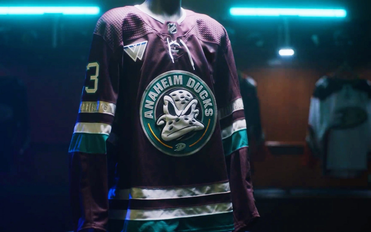
The Anaheim Ducks are celebrating their 30th year in the league with an homage to their first jerseys. The body of the jersey is a deep crimson-purple, and the logo is inspired by “The Mighty Ducks” movie series, which is where the team originated. These jerseys are nostalgic not just for Ducks fans but for those who grew up on hockey movies. The purple is a callback to the original Ducks jerseys in 1993. These jerseys perfectly tie retro and new together without baiting on nostalgia.
The Minnesota Wild revealed a new alternate jersey that perfectly captures where they came from, and where they are going. The jerseys are green and gold and pulled straight from the Minnesota North Stars who played in Minnesota from 1967-93 before the Wild. These jerseys also feature Captain C and Alternate Captain A in a patch of Minnesota. Not only do the jerseys look clean they also invoke the history of Minneapolis and hockey in the city. The green strays far enough away from the Wild’s usual forest green to show just how different the jerseys are. These are not the same jerseys with a fresh coat of green paint. They are thoughtfully planned and executed, which makes them entirely new.
Finally, the Winnipeg Jets unveiled a jersey that pays homage to the Royal Canadian Air Force Flyers, who were a hockey team in 1948 and won gold at the Olympics for Canada. These jerseys pay homage to not only the hockey team made up of Air Force men, but all those who have served after. These jerseys feature the Jets current logo over a baby blue taken from the Flyers and two red and blue stripes. The logo currently sported by the Jets is inspired by the Flyers which makes this a perfect choice. There is one issue with the jersey, which is where the logo is placed and how it overlaps with the upper red stripe. Other than that, these are incredible and deeply meaningful jerseys.
The NHL is always releasing new jerseys, so there are more to come as the season begins. The more jerseys a team has the more ways fans can show off their dedication. Each jersey tells a story and will mean something different to each fan who reads a different meaning behind the colors and logos.